
Ultrasound 101 – Part 10: Color Doppler

Welcome to Ultrasound 101. In this 12-part series, we will talk about the basic principles of medical ultrasound, the equipment you will use, the settings on your machine, and of course, how to use sonography in your patients. Each part will focus on a specific topic and allow you to experiment with the scanner, adjust the settings on your machine, and get the best out of your ultrasound examination.
So far, we have only talked about B-Mode, or brightness mode, in ultrasound. While this is the most used mode and the foundation of all sonographic imaging, your machine (and you) can do more than "just" display images in different shades of gray. So today, you will learn about color Doppler, which allows you to depict flow information on your screen and is the first step to discovering hemodynamic measurements. So let's get started!
The Doppler effect
Before we go into detail about color Doppler, we have to briefly discuss the physical background behind the world of Doppler ultrasound - the Doppler effect. An Austrian physicist, Christian Doppler, discovered that the frequency of sound waves changes when their source moves towards or away from the receiver or listener (given that the receiver stands still). We experience this phenomenon multiple times a day - whenever a car drives by us, the engine's sound gets higher as it approaches our ear and lowers again once it passes us. The clearest way you will experience this is when an emergency vehicle running its siren drives past: you and I know that the siren continuously emits the same absolute pitches (= sound frequencies). Yet, the tone we perceive changes as it speeds past. This is the Doppler effect.
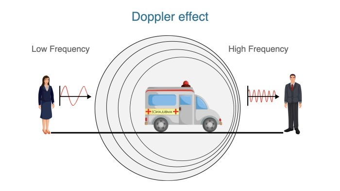
But what does all this have to do with ultrasound? As you know, the transducer we use to image our patients emits and receives thousands of sound waves, which get reflected in the human body. Physically speaking, once the sound waves hit an object that creates an echo, said object becomes the source of the sound. Now, if the reflecting thing is moving, this creates a Doppler effect received by the transducer - it receives different frequencies than it sent out. Through highly technical magic built into your scanner, your screen can display flow information calculated from the aforementioned shift in frequency. Most of the time, we look at blood flow when using Doppler ultrasound, and the moving sources of sound waves are the erythrocytes coursing through the patient's blood vessels. It is easy to understand that this depends on the transducer resting as still as possible on the patient's skin - if you move the receiver, there's no way for your machine to calculate the relative velocities correctly.
Why use color Doppler?
So, Doppler ultrasound can be used to display - and measure - blood flow. This is not only relevant in hemodynamic measurements but can help you tremendously when you have trouble orienting yourself or securely identifying objects on your screen. For example, if you look at an anechoic (black) structure close to the liver, you might be unsure if this is the gallbladder or a liver vein, especially if the patient has eaten and the gallbladder is empty. Just put the color Doppler window above the structure: if you see blood flow, it's a vessel; if you don't see any flow, it's probably the gallbladder (or some other fluid buildup outside of a blood vessel).
Another great area to use color Doppler is the extremities: think of the popliteal fossa. You might want to look for deep vein thrombosis or for a nerve to block with regional anesthesia, but there are a lot of fascias, different muscles, and tendons in this area, and the blood vessels are relatively thin since we are pretty far from the heart. It can be hard to get your bearings here, and we often use blood vessels as landmarks in ultrasound (especially in regional anesthesia). Placing a color Doppler window over the area you suspect blood vessels are in will help you tremendously - blood flow literally lights up on your screen, and when you take a close look, you can even get a hint if it's an artery (pulsating) or a vein. Just be careful not to use this pulsating feature as your only distinction between arteries and veins, as veins running close to arteries can look like they have a pulse (the best way to distinguish them is that healthy veins can be compressed with your ultrasound probe, and arteries can't).
What you can see in a color Doppler image
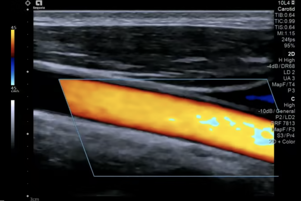
This is a video of the carotid artery in a longitudinal view, with color Doppler enabled. You can clearly see the pulsating color filling out the vessel. However, looking closely, you will notice that the color is not homogenous throughout the vessel, as blood flow is not homogenous within an artery. Also, note that there is no color flow outside of the vessel.
When color Doppler is enabled, you will see a color scale at the side of the image - in this case, it's on the top left side - and you will notice that this scale goes from one color to another and from negative to positive. Negative and positive values, in this case, refer to the depicted flow going towards (positive) or away (negative) from the transducer. With the settings in this video, red is positive, meaning blood in this vessel flows towards the transducer, i.e., from the bottom right of the screen to the top left. You can also see that the color scale is a continuous spectrum, with yellowish-red at the top. This allows you to assess flow velocities on the screen semi-quantitatively: the more yellow the color in the vessel is, the faster it flows. You can change the color scale while imaging, so don't assume it always has to be the same color coding as in this example (although the settings here are according to imaging conventions).
I also want to draw your attention to the diagonal box in the middle of the screen - this is your color box. In the borders of these lines is where your machine measures flow and velocities, and you can see that while the vessel clearly extends to the left of the box, there is no color there. You can move the box around on your screen (usually using the trackball) to place it over the region of interest. You can also change its size - a smaller box takes less computing power and thus increases the frame rate - and its angle, which we will come back to in a second.
The last thing I want to point out is the numbers at the top and bottom of the color scale, in this case, 45 and -45. You can see that these numbers have a unit, cm/s in this case, so this is the maximum and minimum flow velocity that will be displayed correctly on the color scale. This means that yellowish-red roughly equals 45 cm/s, and whitish-blue equals -45 cm/s, again allowing you to assess velocities with just the color display semi-quantitatively. This scale can also be adjusted, as blood flow velocity differs significantly throughout the body from the aorta to a distal artery like the posterior tibial artery. Blood in veins also flows much slower than in arteries.
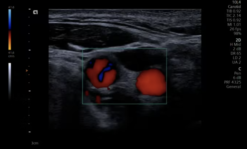
This is again a video of the carotid arteries, this time after the bifurcation. The two vessels you can see are the internal and external carotid arteries in a transverse view. You can also see the pulse in the arteries in this image orientation, which is the most common orientation you will use when looking for vessels.
Red or blue?
Now that we know what we can see in a color Doppler image or video, there is a huge pitfall we need to address for you to use this technology successfully, and that is the red and blue color coding. From our anatomy books, we are used to arteries being red and veins being blue, representing oxygenated and deoxygenated blood. But, of course, our scanner cannot know what kind of vessel we are laying the color box over, so this color coding does not apply to Doppler ultrasound. As mentioned above, the color within the vessel only depends on blood flow going either toward the transducer or away from it. This flow direction with respect to the transducer, in turn, entirely depends on how you angle it and where you are in the body.
For example, when imaging the abdominal aorta from above the umbilicus, you might tilt the transducer cranially, having blood flow towards the transducer. If you have not changed the color Doppler settings from the default, flow within the aorta will be depicted as red. When you tilt the transducer caudally, you look at the blood flowing away from the transducer - it will be displayed in blue in the default setting. Of course, this is still the same vessel, and blood within it is still flowing in the same direction in the body - from the heart to the feet - but the flow direction relative to the transducer has changed.
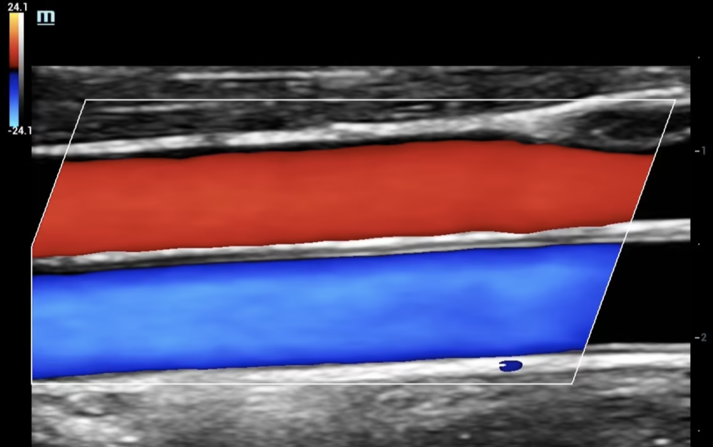
In the video above, you see two vessels, one in red and one in blue. Both have a certain degree of pulsation, but the blue one seems to have more pulse than the red one. This is a loop of the carotid artery and the jugular vein. The carotid artery is the vessel on the bottom (it not only has "more pulse" than the vein, but it also has a thicker wall, and we traced it when we recorded this loop). The color scale is set in the same direction as before (red - towards the transducer, blue - away from it), but in this example, the artery flows away from and the vein towards the probe. This example illustrates what two vessels with opposing flow might look like in ultrasound and emphasizes the fundamentals of color Doppler: the color depends on the direction of flow relative to the transducer, not on the ‘real’ blood flow within an anatomical structure.
The Doppler angle
Speaking of angles, there is one last fact we still need to mention: Doppler readings are angle dependent. To get a perfect reading, blood should flow exactly towards or away from the transducer, which is hardly ever possible (you can't put your probe inside the patient's head to get a good reading on the carotid artery). Ultrasound scanners are very smart and calculate for this inherent limitation. We don't need a perfect alignment with blood flow to get a good reading, but every degree toward it helps reduce measuring errors. Aiming the ultrasound beam perpendicular to the vessel in question will lead to no Doppler reading or false low readings. The more you angulate the transducer, the better your reading gets, and your machine can even help you further by letting you set the angle to a certain point - this is what the slanting of the color box is for. Don't worry too much about this though, because to be honest, this angle of insonation is hardly relevant when you try to identify a vessel or look for a landmark. Once you want to do hemodynamic measurements and such, you will need to learn a lot more background knowledge, but for now, remember that tilting your transducer slightly might get you better readings.
Conclusion
In today's part, you got to know a whole other imaging modality: color Doppler. You now know that it depicts flow direction and velocity and that you can use it when looking for blood vessels or unsure whether the structure in question is a blood vessel. We barely scratched the surface of Doppler imaging today. There are several more modalities and applications for this fascinating technology, which become relevant when you want to do advanced imaging with your ultrasound machine - we could make a whole series just about this. For now, try incorporating color Doppler in your imaging routine, and get familiar with placing the box, angulating the transducer, and interpreting the color scheme and blood flow. Next time, we will discuss describing an ultrasound image and some special vocabulary you will need when writing or reading a report. Until then, enjoy imaging!